|
Plinio Corrêa de Oliveira
Why I chose the Lion?
TFP Viewpoint, Vol. 8, No. I, page 3 (*)
|
|
|
Symbols are a powerful way to convey ideas. Prof. Plinio Corrêa de Oliveira explains what’s in the TFP lion.
I chose the lion for the standard of the TFP because the lion always reminds me of a principle which I insist on defending at every opportunity. It is the principle of legitimacy. It means that power, influence, wisdom, or glory should reside in the people or institutions who have the right to them. This, of course, is a very summarized way of defining the principle of legitimacy.
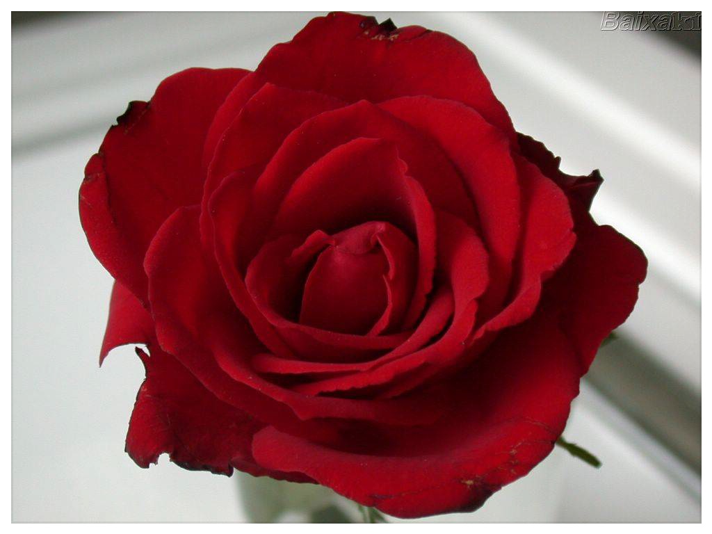
Now, obviously, what the lion is among animals, the rose is among flowers. The rose is naturally the queen of flowers. Just place a truly beautiful rose among any other species of flower — even among orchids — and the rose outshines them all. The rose is indisputably superior. Nature is full of symbolism for those with eyes to see. Put a lion among all the other animals. They are eclipsed! The elephant may be bigger, but it is a brutish mass. The camel may be a great walker, but it walks with the gait of someone bearing a heavy load, not with the elegance of a lion. The lion bounds, the camel plods. How about a fox? For sure the fox is smart. But he is also fragile. Unless he can outwit his opponent he is lost. What about all the rest of the animals? Each has its own special quality, but they don’t represent that ensemble of qualities that makes the lion a lion. Look at the lion: he is king. He knows he has the rights of a king. He commands; he has the strength of a king; he rules. For our standard it was obvious that the lion should have a kingly color. The proper color for regal things is gold. A silver lion would be a disappointment. A golden lion — how natural!
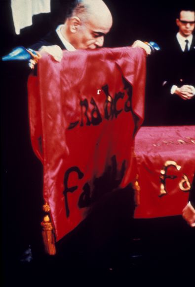
Behind is a red field. Red is the color of battle. But what about a blue background? I hesitated between blue and red, but not for long. Artistically, I suppose gold is more beautiful on blue than on red. The combination of a well-chosen blue with gold is simply lovely. But blue somewhat neutralizes the liveliness of gold. And I did not desire our campaign standards to be placid. They need to symbolize our fight! (*) Excerpts of a conference (7th February 1987). Without revision of the Author. TFP Viewpoint is published by the Tradition, Family, Property Bureau for the U.K. editor @ tfpuk.org.uk
|
|